Elena Mauri

Locorum, a Marketplace for Community-Led Travel

Locorum is a marketplace for travel experiences created by local communities in central Italy. I worked on it from the first technical choices to the finished design: platform, information architecture, wireframes, visual identity and UI.

The project

  • Context: Locorum is one of two connected products. The other is a certification platform for travel experiences, which I also designed. The two are kept separate on purpose, because the body that certifies an experience cannot also be the one selling it.
  • Team: a project manager and a team of developers. I was the only designer.
  • Platform: a multivendor marketplace built on WordPress and WooCommerce.
  • Status: launching soon.
  • What I did: research on technical options, information architecture, wireframes, visual identity, UI for desktop, tablet and mobile, and accessibility checks.

More than selling experiences

The client did not want another booking site. The goal of Locorum is to bring new life to inland areas of central Italy, and experiences are the way to do it.

Everything starts from territorial projects. A project is born inside a region, or across more than one, and is run by a local community: the operators who sell the experiences, local authorities and facilitators. Each project has one of four identities chosen by the client: Rock, Wind, Silence and Play. The identity is the common thread of all the experiences in that project. The people who create the experiences are called custodians, and travellers meet them on every experience page.

The audience is people looking for real, unusual experiences, who want to get to know a place through the people who live there.

Same starting point

Locorum came out of the same workshop as the certification platform, with the client's CTO and marketing manager. I ran it together with our project manager. For Locorum the discussion focused on the idea behind the brand, on how territorial projects and identities should work, and on what the client needed to manage on their own after launch.

Choosing the platform

Before designing anything I spent a full session comparing technical options, including ready-made marketplace platforms for experiences. I looked at costs, timing and multivendor features, but the deciding factors were three: how much the client could manage on their own, how far we could customise the design, and how easily the platform could grow.

From a technical point of view Locorum is a multivendor marketplace. Many sellers share the same site: every operator has their own vendor account, publishes their experiences, sets availability and manages bookings. Travellers see one catalog and book any experience with the same cart and checkout, whoever sells it. The client runs the platform, approves vendors and keeps the content consistent.

In the end I chose this stack:

  • WordPress as the base, for pages, the blog and all the content the client edits on their own.
  • WooCommerce for the catalog, cart, checkout and payments.
  • Dokan for the multivendor layer: vendor accounts, vendor stores and the vendor dashboard.
  • WooCommerce Bookings for reservations: dates, availability and number of participants.

It gave us a marketplace the client can run independently, with full freedom on the front end. We kept the Dokan vendor dashboard as it is, and put the design work into what travellers see.
Two ways in

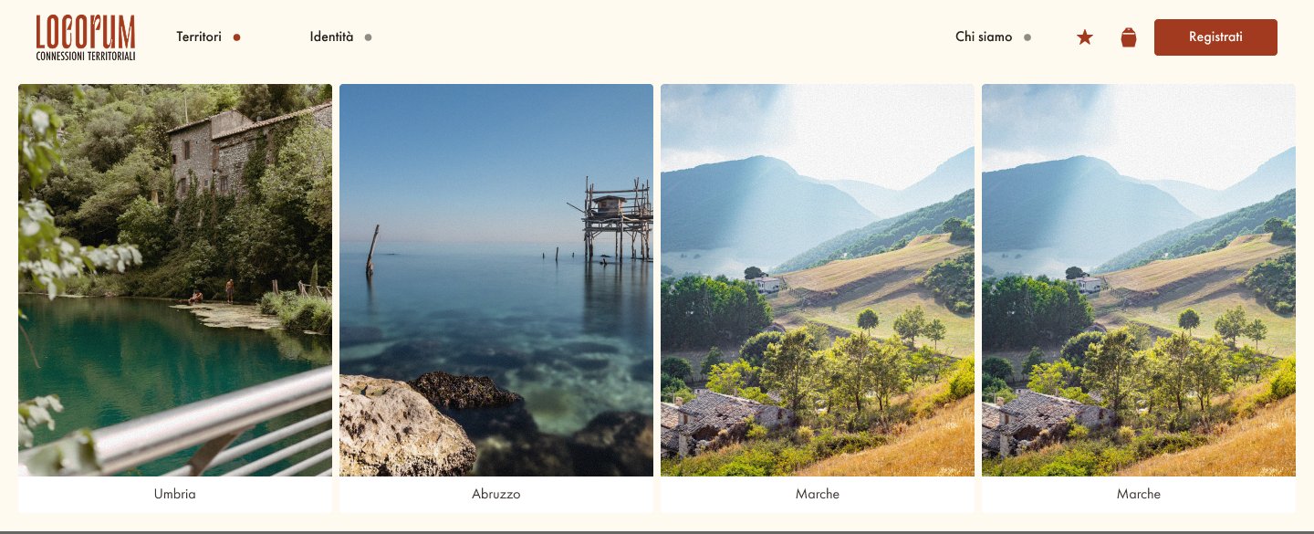
The structure follows the idea behind the brand. Travellers can explore in two ways: by territory, going from a region to its territorial projects, or by identity, starting from Rock, Wind, Silence or Play. Both paths lead to the same territorial projects and, from there, to the experiences.

Around this core sit the pages for the community (about us, how it works, FAQ, contact), the account area, wishlist, cart and booking, a blog called Voices of the Territory, and the pages for vendors and blog authors.

Territories menu with a photo for each region

Earthy, bold and raw

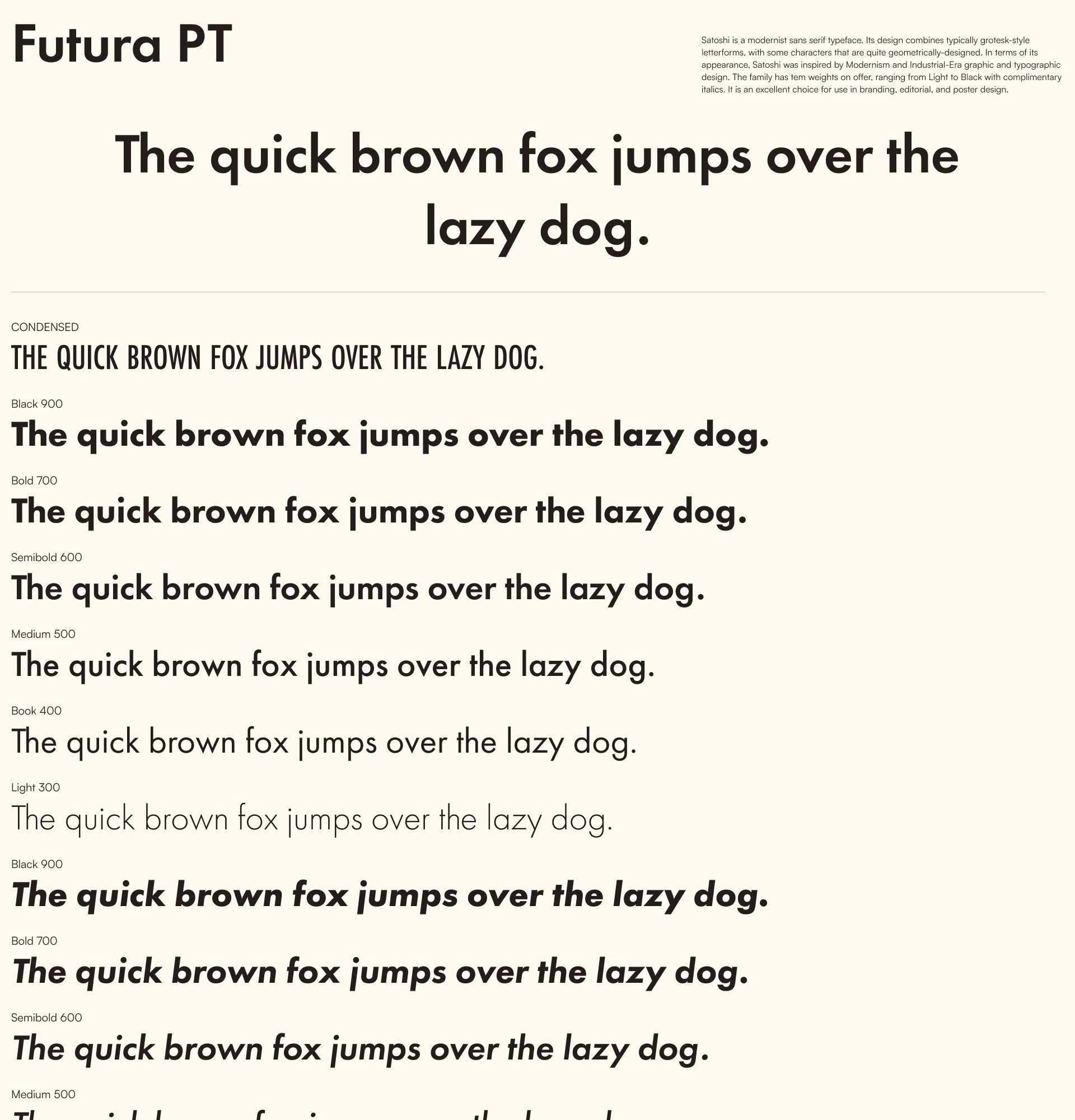
I designed the whole visual identity, starting from the name: Locorum is a strong word, so the type had to be strong too. I chose Futura PT. Its geometric shapes feel solid and direct, the condensed version works well for titles, and the many weights cover everything from headlines to small labels.

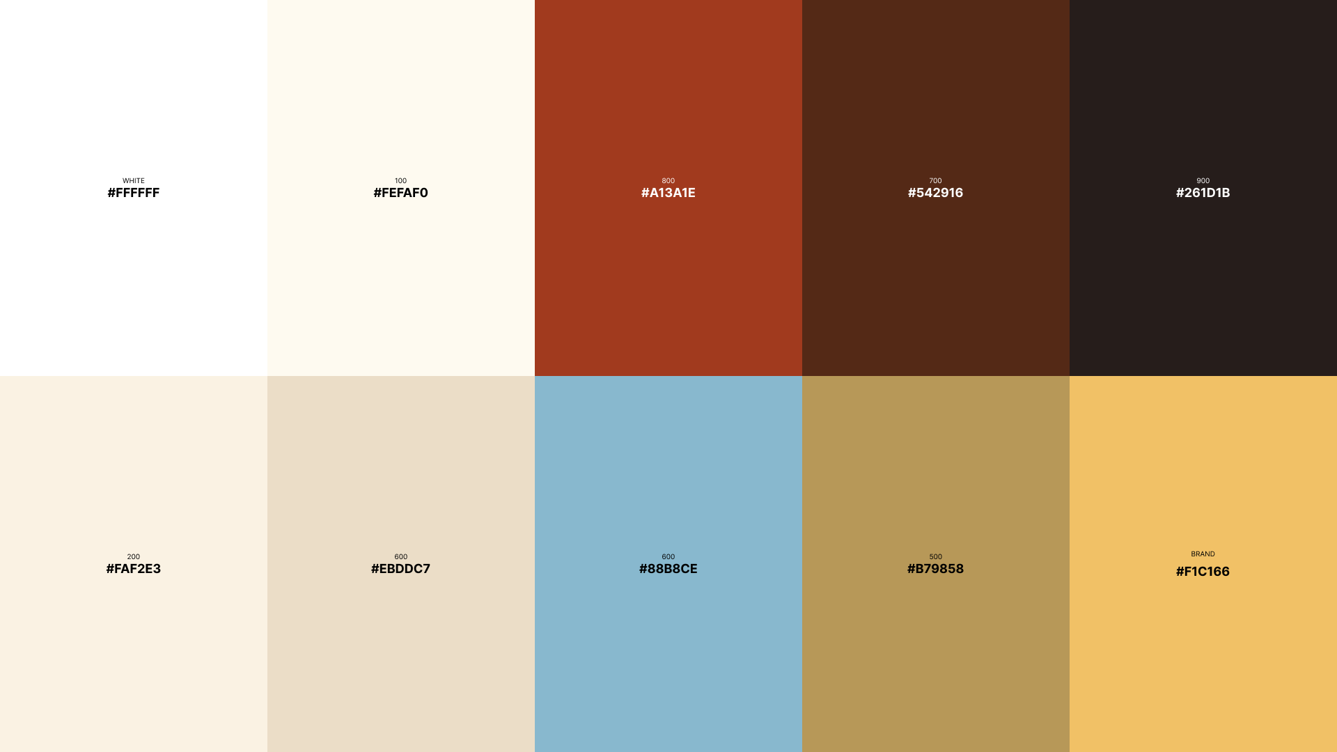
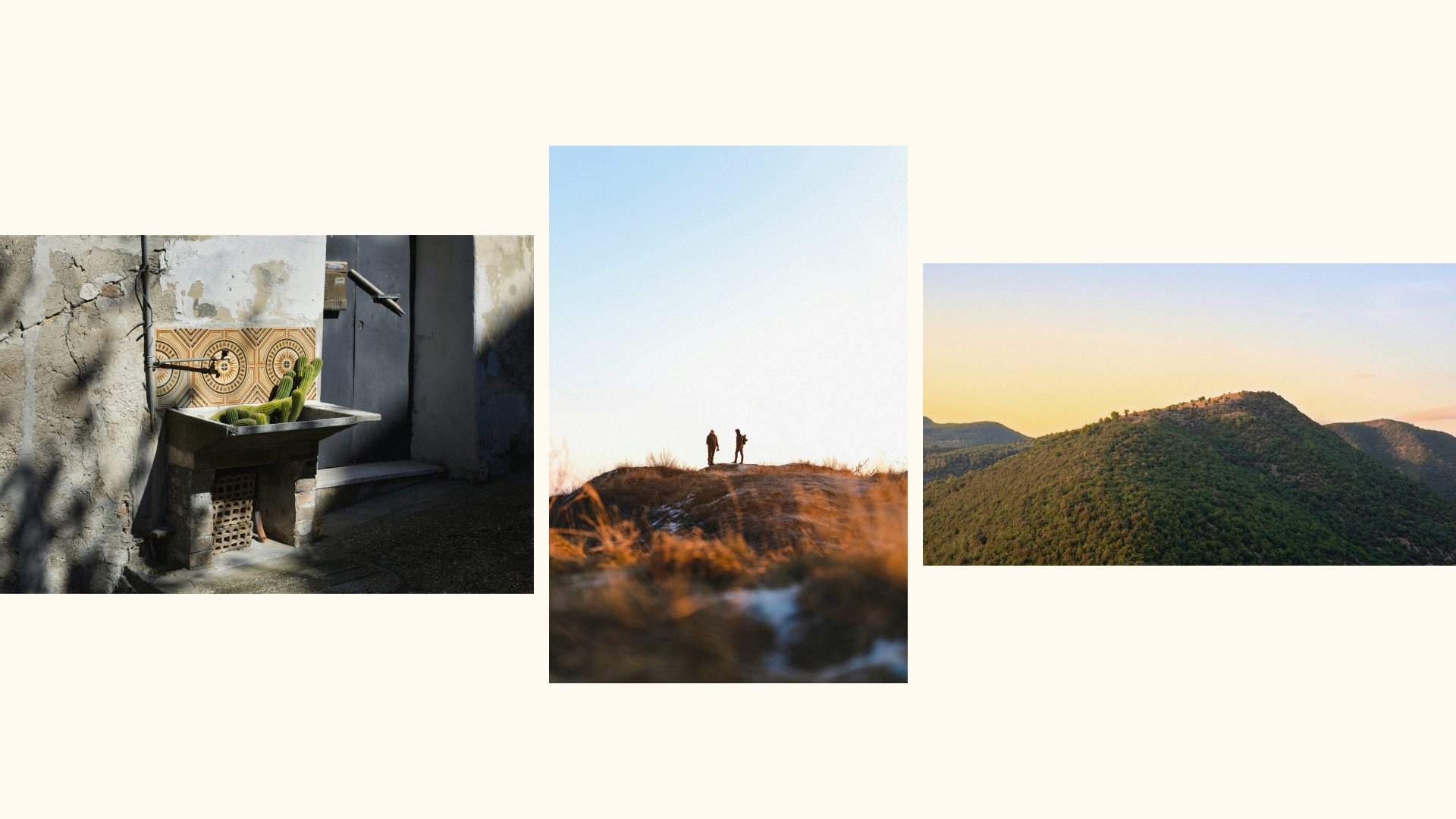
The palette comes from the colors of the land: rust, dark brown, warm sand and cream, with a sunny yellow as the brand color and a soft blue for water and sky. Photos get a light grain on top, so they feel more like real places and less like stock images.

Futura PT specimen with condensed, regular and italic weights
Locorum color palette, from cream to rust and dark brown Photos with a grain treatment

A custom icon set

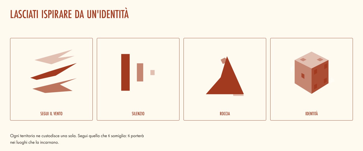
I drew all the icons myself, from interface icons like account, wishlist, cart and favorites to the four identity icons. I wanted them to feel original and a bit raw, made of simple shapes and flat colors from the palette, instead of the thin generic icons most booking sites use.

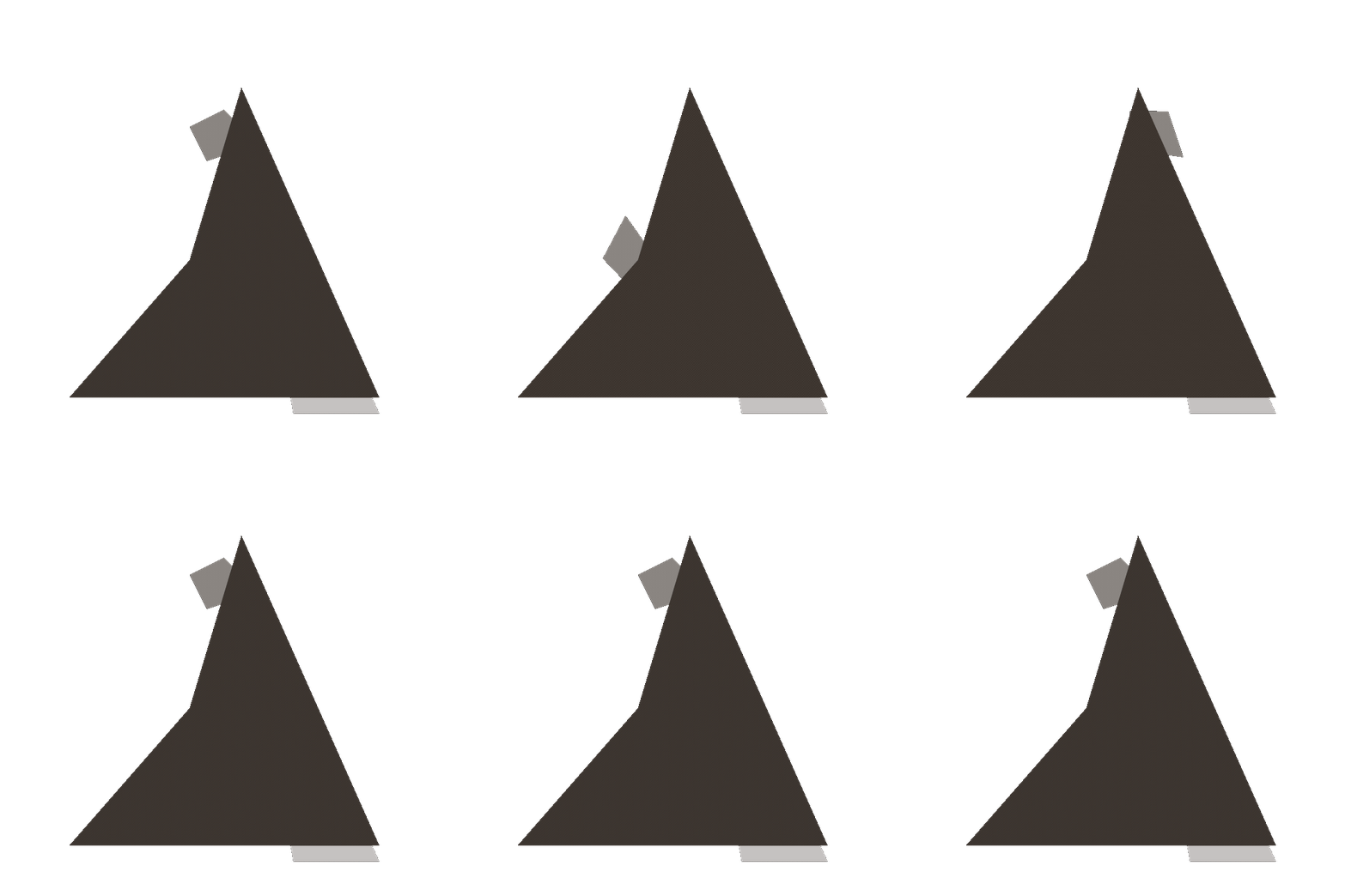
The identity icons are animated. When the mouse moves over them their shapes come to life, as in the three examples below: Rock, Play and Silence. I designed the animations in Figma and handed them over to development as prototypes.

The four identity icons: Wind, Silence, Rock and Play
Animated Rock identity icon Animated Play identity icon Animated Silence identity icon
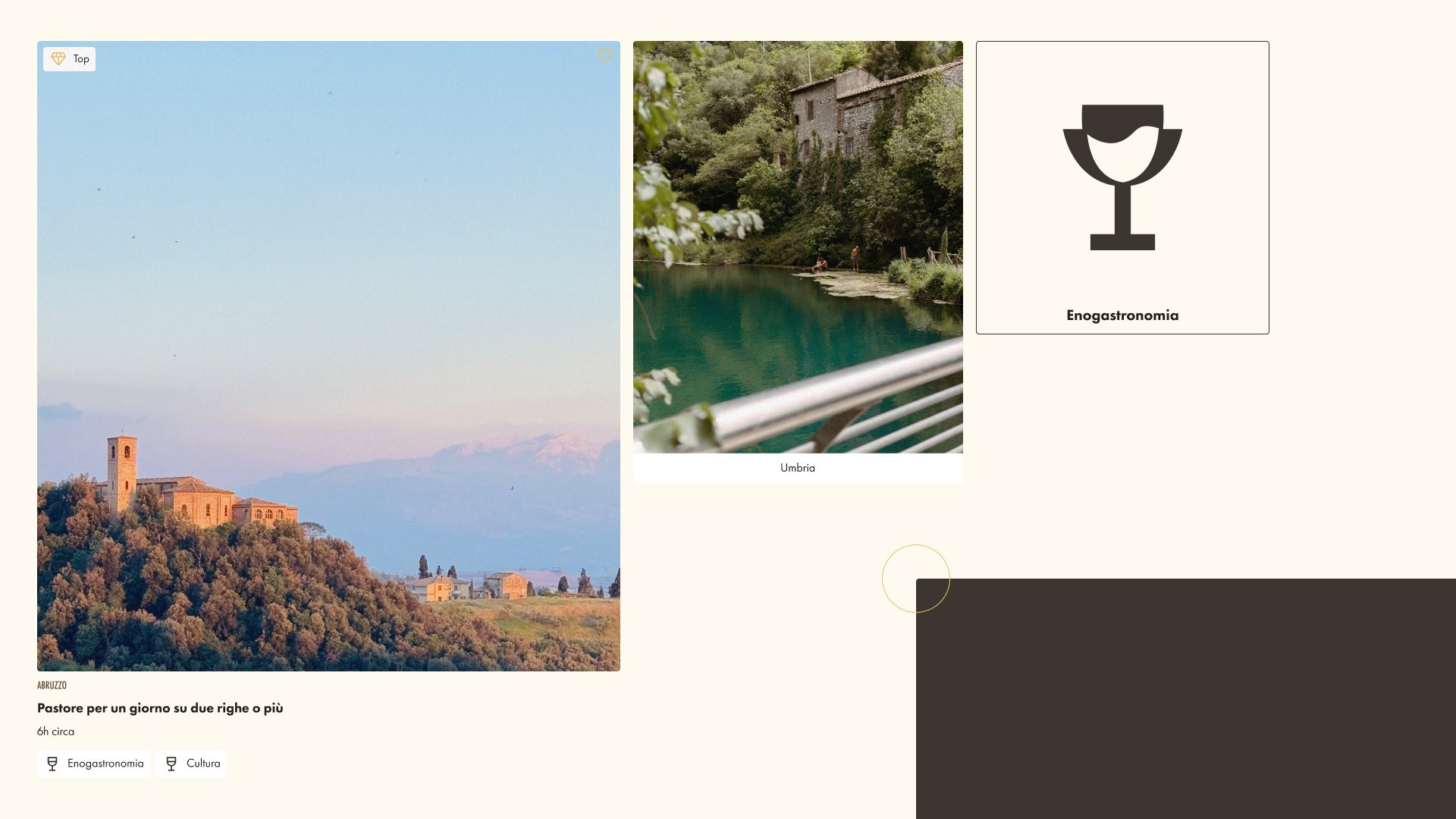
Experience card, region card and identity card

An immersive home page

The home page opens on a full screen photo of hands at work and a line that sums up the brand: some places are not visited, they let themselves be told. A search bar lets people look for a territory or an identity right away. Below, the page goes through the regions, a selection of experiences, the Originals concept, the territorial projects with their identity and number of custodians, the four identities and a call to communities that want to join.

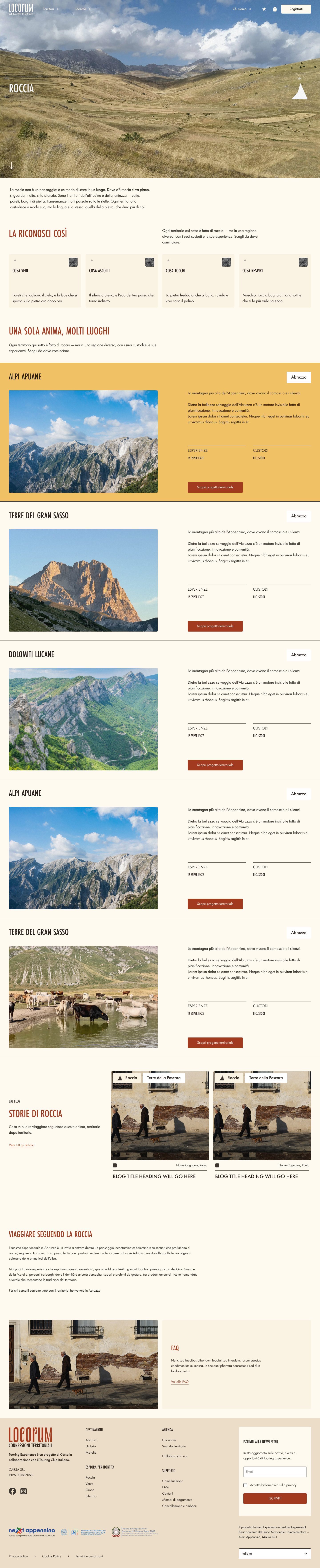
Each identity has its own page. The Rock page, for example, describes how to recognise the identity through the senses (what you see, hear, touch and breathe), lists the territorial projects that share it and ends with stories from the blog.

Locorum home page Identity page for Rock with territorial projects and stories

Everything needed to book

The experience page combines storytelling and booking. It starts with a photo gallery, while the booking box stays visible on the side: price, number of adults and children, and date selection. The rest of the page covers what to expect, season, duration, languages and difficulty, the itinerary, what to bring, accessibility, what is included, why the experience was created and the meeting point on a map.

At the end the page introduces the operator and the custodians, the people who created the experience, then suggests related experiences and the territorial project it belongs to.

Experience page with gallery, booking box, itinerary, custodians and related experiences

The traveller's area

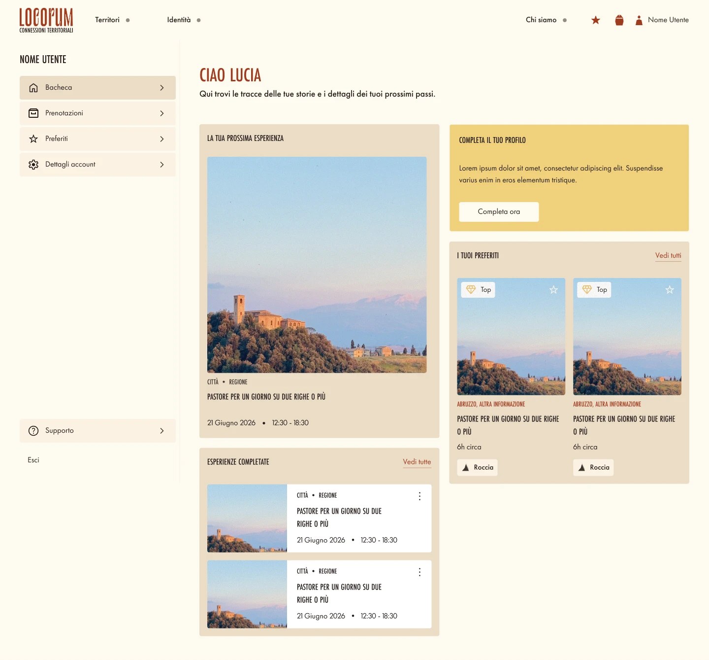
I designed the whole purchase journey, from cart and booking to sign up and the account area. The account opens with a dashboard that shows the next booked experience, a reminder to complete the profile, saved favorites and past experiences. From the side menu travellers can manage bookings, favorites, account details and support.

Account dashboard with next experience, profile reminder, favorites and completed experiences

A library of sections

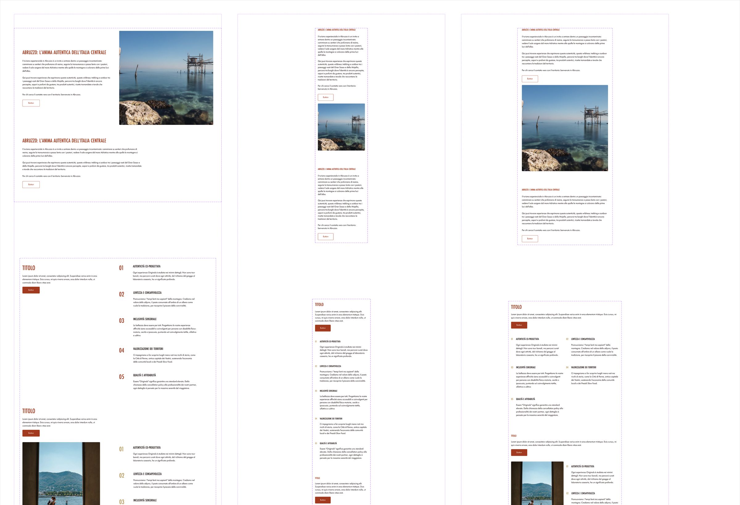
I designed every page for desktop, tablet and mobile. To make the site easier to build and to grow, I organised the design as a library of sections, each with its three versions. The team can combine them to create new pages, like a new region or territorial project, without starting from zero.

I also checked the design against WCAG guidelines, from color contrast and text sizes to the states of buttons and links.

Section library with desktop, tablet and mobile versions

My Role & Deliverables

  • Workshop with the client's CTO and marketing manager, run together with the PM.
  • Research on technical options and choice of WordPress, WooCommerce and Dokan.
  • Information architecture and sitemap, with two ways in: territory and identity.
  • Wireframes for all pages and for the booking journey.
  • Visual identity: typography, palette, photo treatment and a custom icon set with hover animations.
  • UI for desktop, tablet and mobile, organised as a library of sections.
  • Accessibility checks based on WCAG.

Where it is now

Locorum is about to go live, so there is no usage data yet. The site is built on a platform the client can manage on their own, with an identity that is entirely its own and a structure that can grow with every new territorial project.

Interactive Mattress Configurator