Elena Mauri

Certification Platform for a Travel Experience Network

I designed a platform that certifies travel experiences before they are listed in a public catalog. Operators fill in a self-assessment to get the Silver badge, then an auditor visits the experience as a mystery client and can award Gold. I followed the project for ten months, from the first workshop with the client to go-live, working on the management platform and on the public catalog.

The project

  • Timeline: January to November. The platform is going live now.
  • Team: a project manager and a team of developers. I was the only designer.
  • Context: the platform is one of two connected products. The other is a marketplace where the same experiences can be booked, which I also designed.
  • What I did: the workshop with the client, the research on possible solutions, user flows, roles and permissions, the choice of the component library, wireframes and UI for the management platform. For the public catalog I also worked on the information architecture and the visual identity.

Turning a quality process into a product

The client works with a network of independent operators who offer travel experiences: tours, food and wine, culture, outdoor activities. To guarantee their quality they wanted a certification process. Operators answer a questionnaire about their experience, and later an auditor tries it in person without saying who they are. Only certified experiences are listed in the public catalog.

Before this project everything was handled with spreadsheets and emails. The platform had to manage four roles with different permissions, two certification levels, scored questionnaires, deadlines and yearly renewals. Most users would log in only a few times a year, so all of this had to be easy to understand without training.

Starting with the client

We started with a workshop with the client's CTO and marketing manager. I ran it together with our project manager, and the CTO led the more technical parts. Marketing cared about how operators and travellers would perceive the certification, while the CTO focused on what the process had to guarantee.

Together we listed who is involved in a certification, what each person needs to do and see, and where the current process was failing. Deadlines were often forgotten, results were not clear to operators, and nobody had an overview of where each experience was in the process. These problems became the starting requirements.

Who can do what

Defining roles and permissions was the hardest part of the project. Admin is at the top, then the Supervisor, then operators and auditors at the same level. For each role I listed the actions they can take, the data they can see and the limits that keep the process reliable. Operators can see their experiences but cannot edit them, auditors only see their own audits, and a submitted questionnaire can only be changed with a logged reason.

  • Admin manages users, questionnaires, score thresholds and how long certifications last.
  • Supervisor creates experiences, assigns operators, questionnaires and auditors, validates audits and publishes experiences to the catalog.
  • Operator fills in the self-assessment and checks the status of their certifications.
  • Auditor accepts audits, visits the experience and fills in the audit checklist.

The client asked for operator and auditor accounts to start as inactive. They receive the activation email only when the first experience is assigned to them, and they can use the platform only after completing their profile. Until then, every login brings them back to the missing fields.

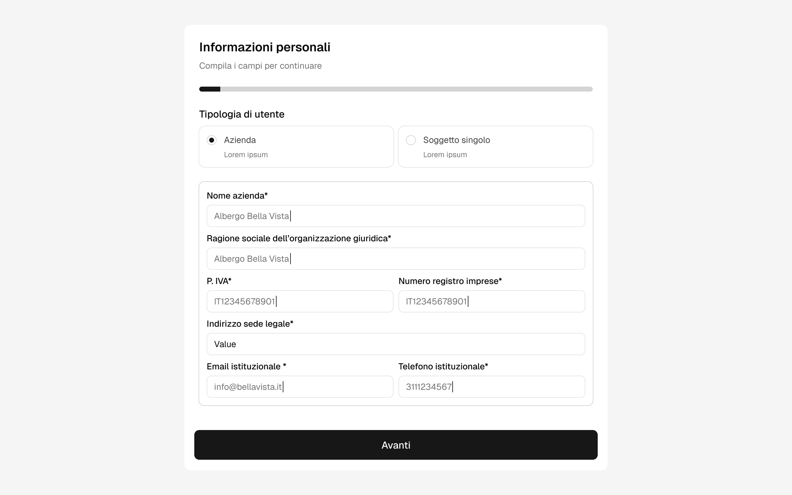
Since this step is mandatory, I tried to keep it short. The first access is a guided form with a progress bar. Users choose if they are a company or a private person, and then see only the fields they need, like VAT number and registered address for companies.

First access: the operator chooses company or private person and fills in the required fields

From self-assessment to catalog

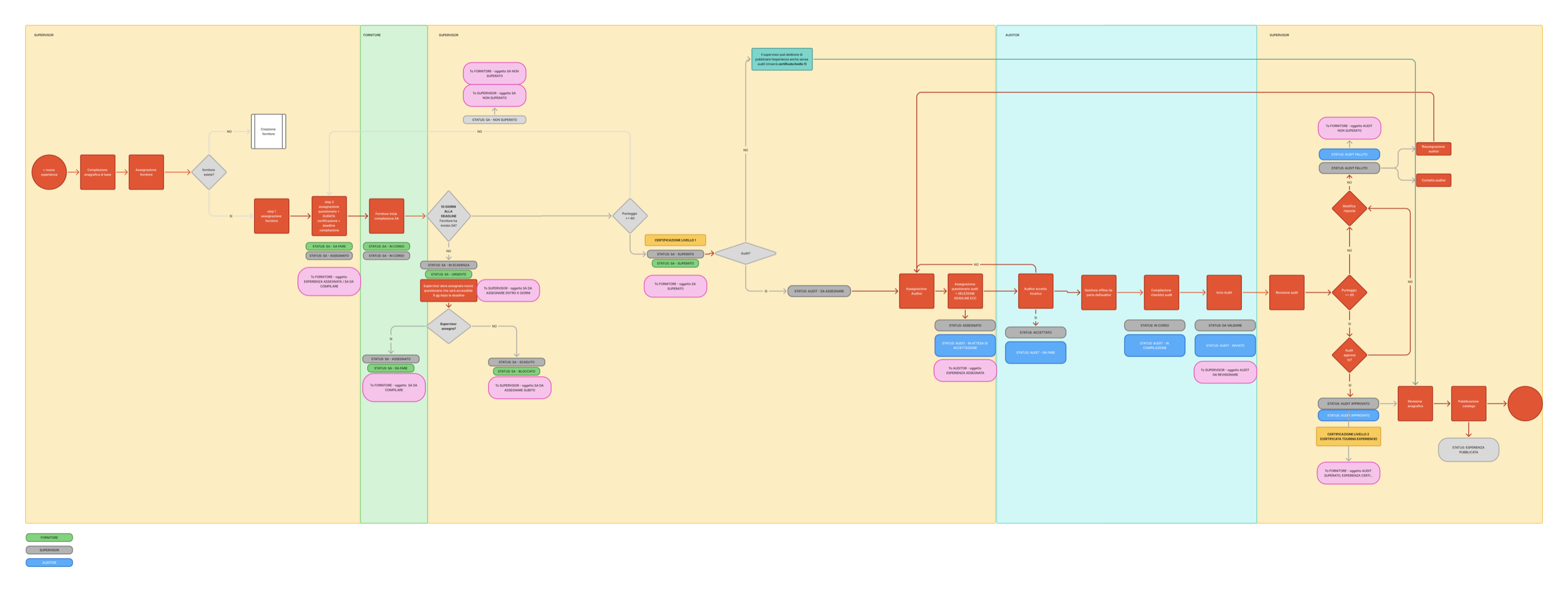
I drew the whole process as a swimlane flow with three lanes: Supervisor, Operator and Auditor. The Supervisor creates the experience, assigns it to an operator and then assigns a questionnaire with a duration and a deadline. If the operator passes, the experience gets Silver and can already be published. The Supervisor can then ask for an audit. The auditor accepts it, visits the experience and sends the checklist, and if the Supervisor approves it the badge becomes Gold.

For each step the flow also shows which status every role sees and which notification is sent. Developers, the PM and the client all used it as the main reference.

Swimlane flow of the certification process across Supervisor, Operator and Auditor, with statuses and notifications

One state, two labels

The process was described in three different documents: the executive specification, the flow and a spreadsheet with all the statuses. At first they seemed to disagree on the steps. Comparing them line by line, I realised that pairs like “urgent” and “expiring”, or “blocked” and “expired”, described the same moment. The operator or auditor sees what they have to do, while the Supervisor sees where the process is.

Event Operator / Auditor sees Supervisor sees
10 days before the deadline To do (urgent) Expiring
Deadline missed, not reassigned Blocked Expired
Deadline missed, reassigned To do Assigned

So we used one status for each process in the backend, and the interface shows a different label depending on the role of the person logged in. This kept the data model simple and let each role read the status in their own terms.

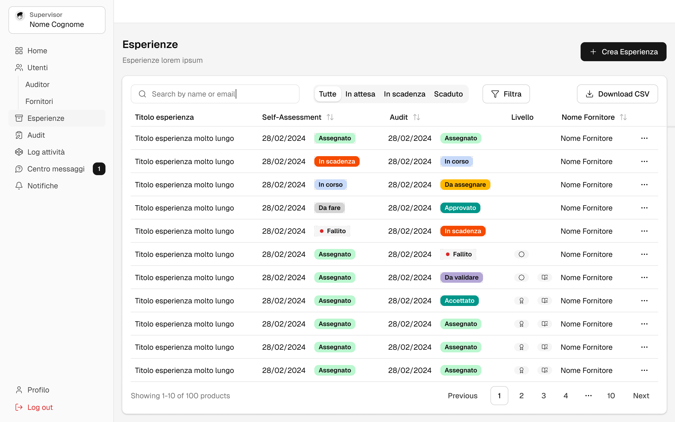
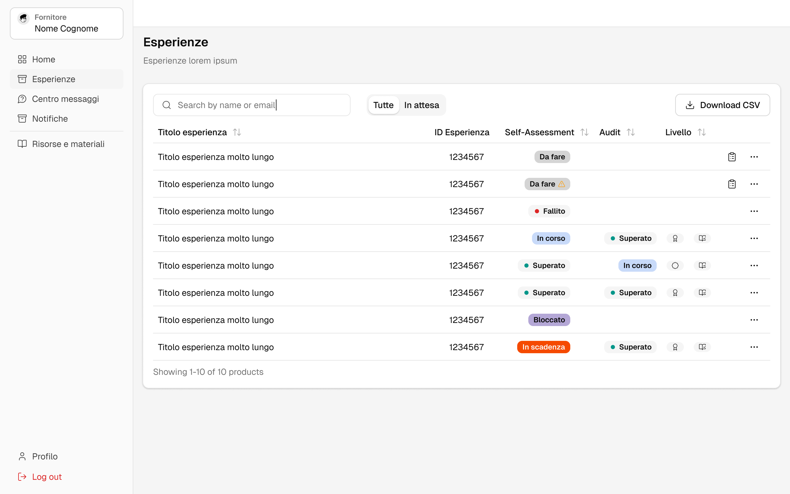
You can see it in the two experience lists below. The Supervisor sees the self-assessment and audit status of every experience, plus the certification level, and can filter by pending, expiring or expired. The operator sees only their own experiences: an urgent task shows “To do” with a warning icon and a missed deadline shows “Blocked”.

Supervisor experience list with self-assessment and audit statuses, levels and filters Operator experience list with the same statuses as the operator sees them

Deadlines and renewals

The second difficult part was time. Every questionnaire has a deadline and every certification has an expiry date, and nobody should have to track them by hand. I designed a set of automatic checks that run every day:

  • Ten days before a deadline the task becomes urgent for the operator or auditor and expiring for the Supervisor, and both get a notification.
  • After the deadline the task is blocked until the Supervisor assigns it again.
  • Silver lasts one year and Gold lasts two. When an experience gets Gold, the Silver expiry is moved to the same date so both are renewed together.
  • Before a certification expires, the Supervisor is reminded to assign a new questionnaire.

Some decisions stay with the Supervisor on purpose. An expired certification does not remove the experience from the catalog automatically. An experience can also stay published as Silver while the audit is in progress, and if the audit fails it simply remains Silver.

Sorting out the inconsistencies

The three documents did not always match. The score thresholds were different, one document had an acceptance step for auditors and another did not, the certification levels had three different names, and it was not clear if an experience could be published without an audit. I collected everything in one mapping document, listed each inconsistency and its impact, and turned the open points into questions for the client, grouped by topic.

This helped the client decide quickly. For example, they confirmed that all notifications are automatic and that Silver experiences can be published without an audit. We also found edge cases early, like a score of exactly 60, which did not belong to either the pass or the fail branch.

Working with shadcn

After comparing a few options, I chose shadcn/ui as the component library for the management platform. The developers could use components that were already accessible and tested, and I had a consistent base for tables, forms, dialogs and badges, which are most of what a back office needs. This left more time to work on flows and statuses.

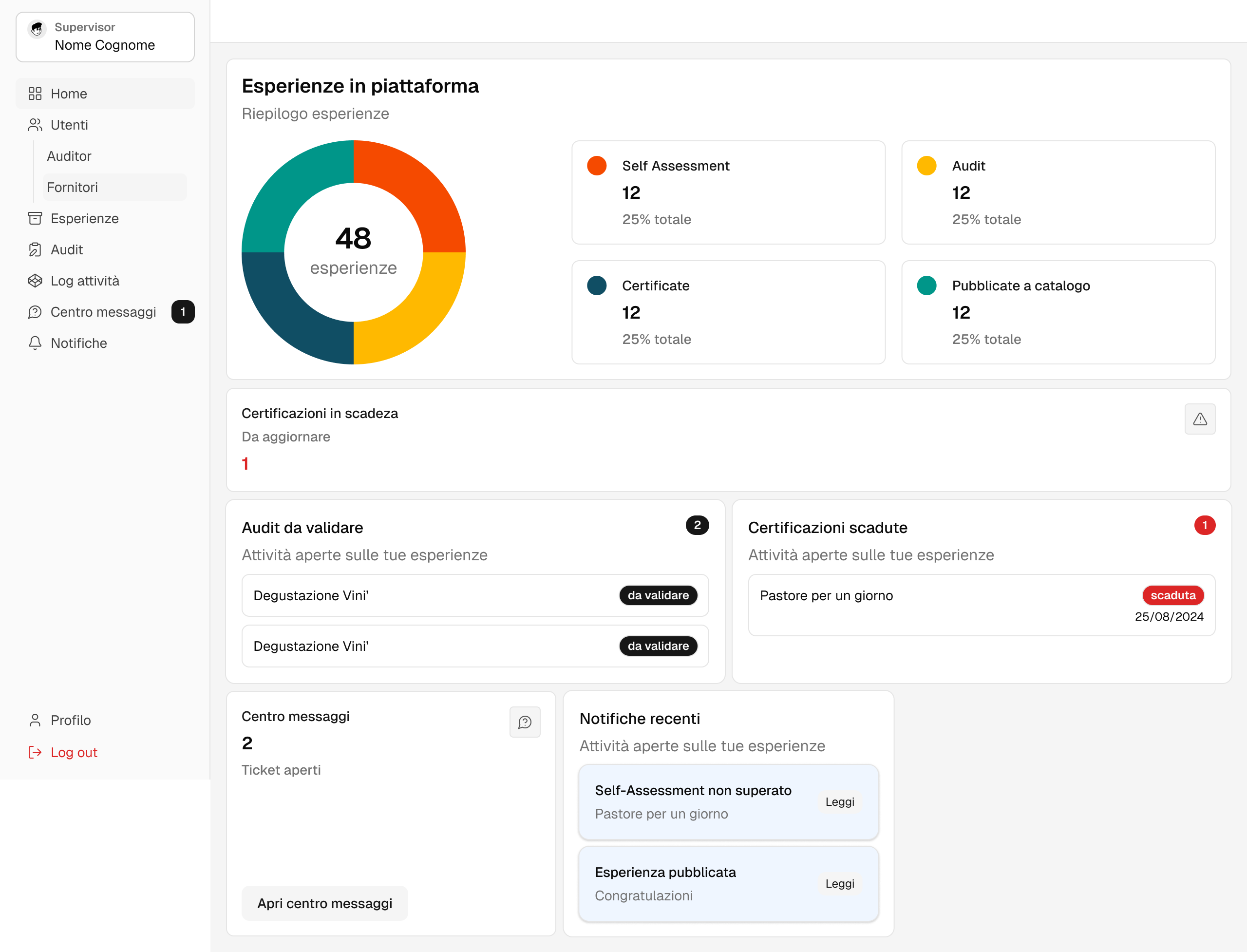
I then designed wireframes and UI for all four areas: dashboards, experience and user management, questionnaires, audits, notifications, a message center for support tickets and the activity log. The Supervisor dashboard starts with a chart of all the experiences on the platform, split by stage, and below it shows what needs attention: certifications about to expire, audits to validate, expired certifications, open tickets and the latest notifications.

Supervisor dashboard with experiences by stage, expiring certifications, audits to validate, tickets and notifications

Making statuses easy to read

With this many statuses, they had to be clear at a glance and could not depend on color only. Each status has an icon, a label and a color, and looks the same in lists, detail pages and dashboards. The certification levels have their own icons, so Silver and Gold are easy to spot even in a long table.

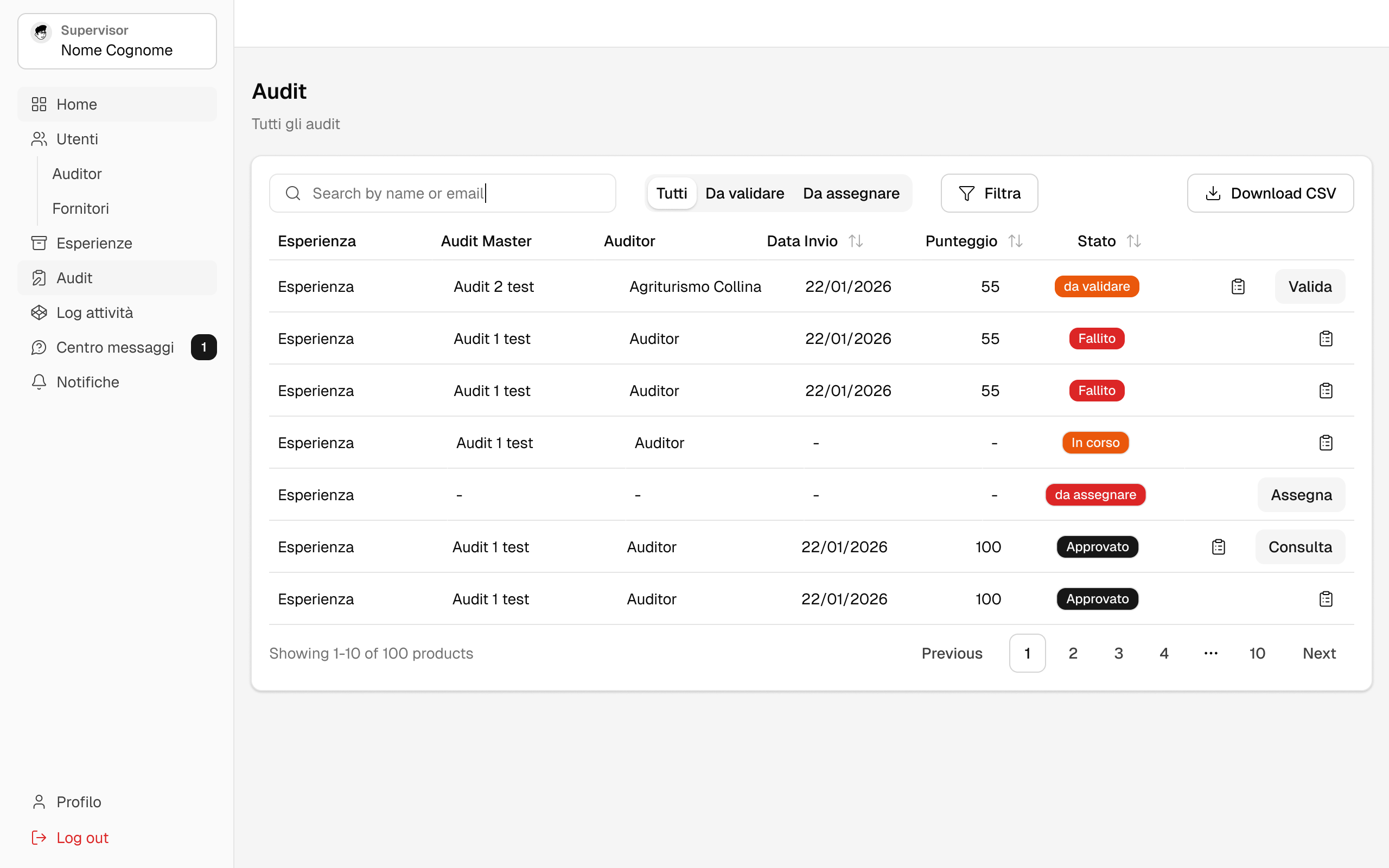
Lists are organised around what needs to be done next. Quick filters show audits to validate or to assign, and each row has the action that fits its status, like validate, assign or view. All lists can be exported as CSV.

Notifications work the same way. When something needs attention, the right person is notified both in the platform and by email.

Audit list with status badges, quick filters and one action per row

One question at a time

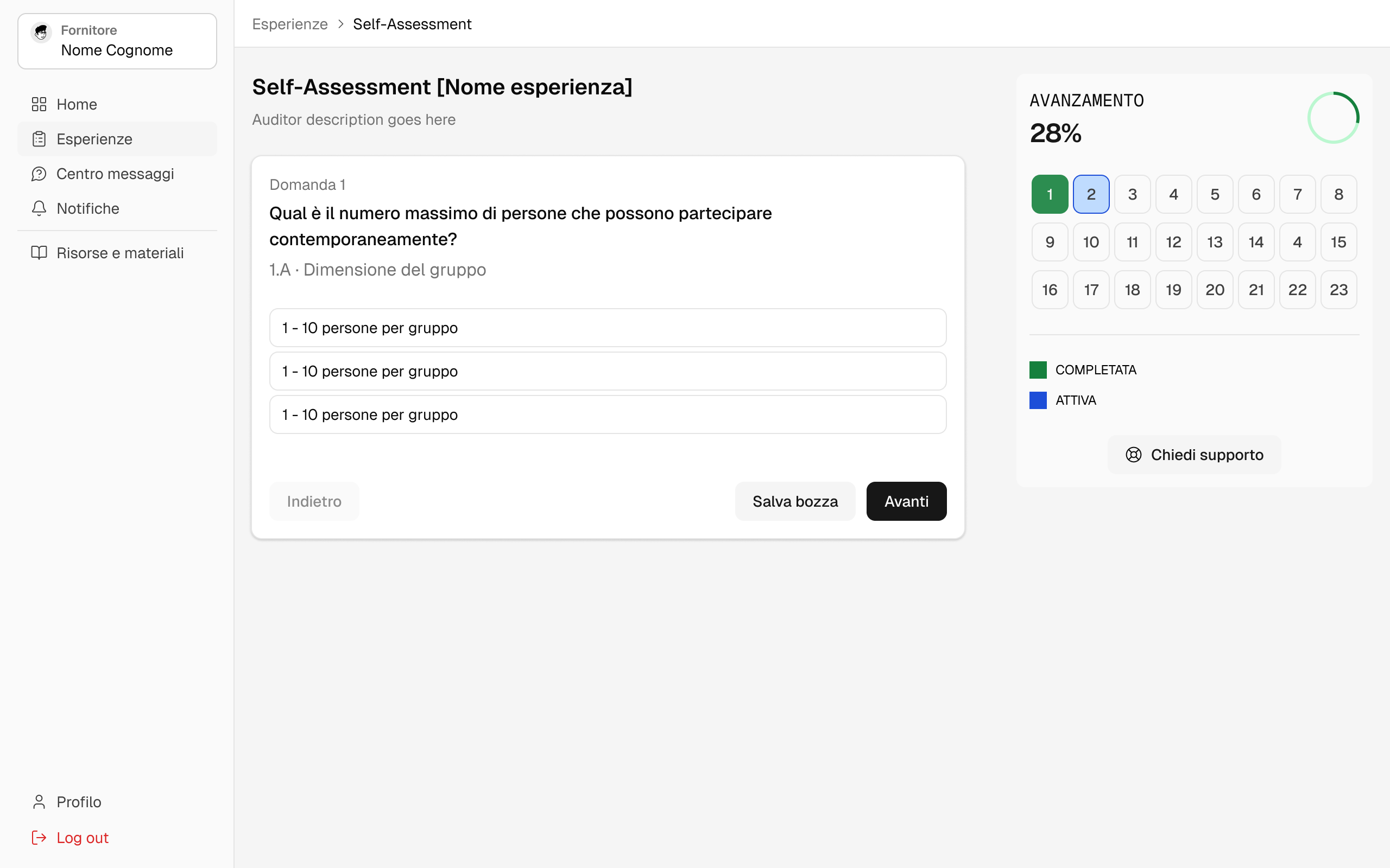
The self-assessment is long and operators rarely complete it in one go. It shows one question at a time, and a side panel shows the completion percentage and a numbered box for each question. Answered questions are green, the current one is blue and the others are empty. Operators can jump to any question, skip the ones they are not sure about and come back later. They can also save a draft or ask for support.

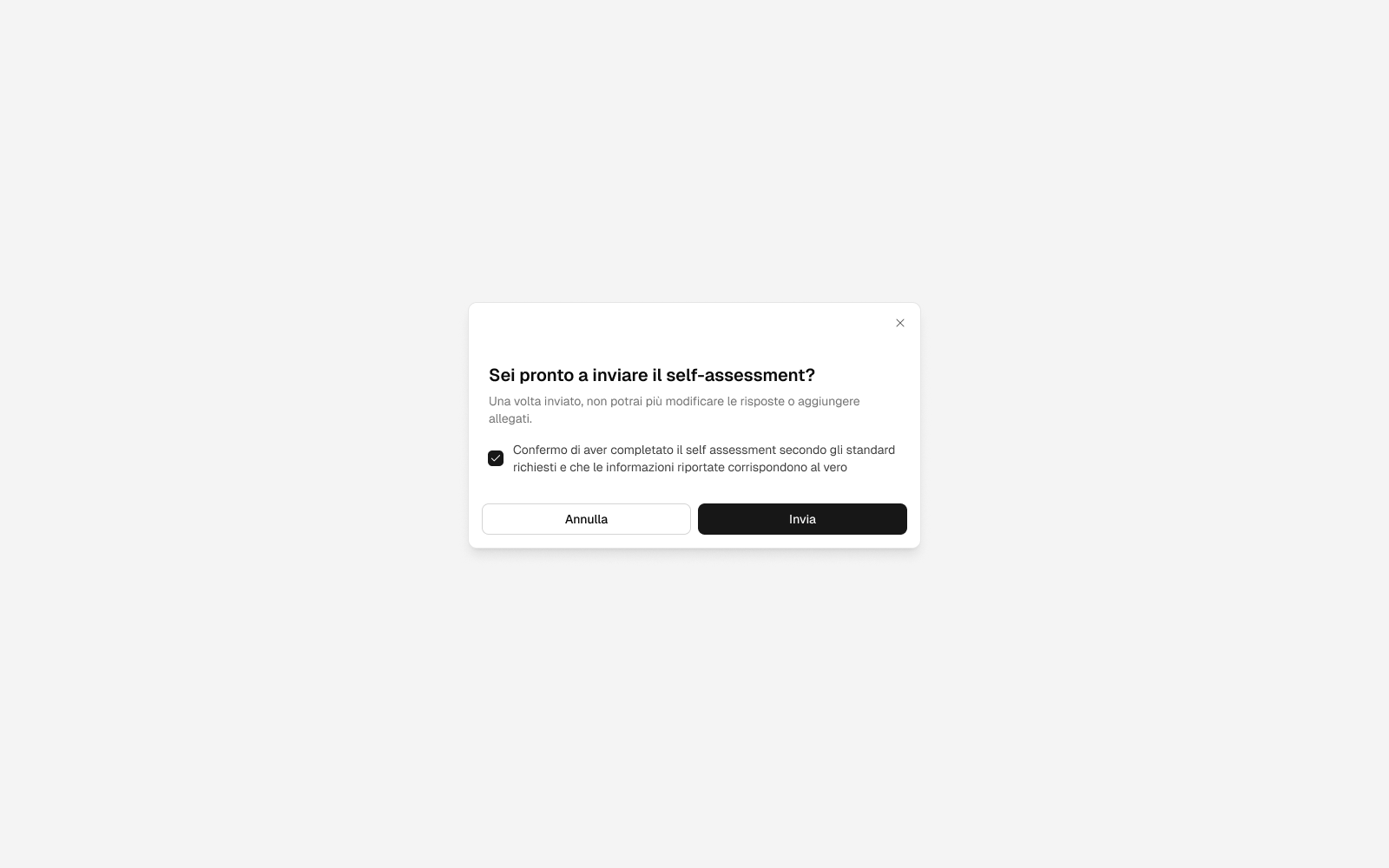
Sending the questionnaire cannot be undone, so I added a confirmation dialog. It reminds operators that they will not be able to change answers or attachments, and asks them to confirm that the information is true.

Self-assessment with one question at a time and a progress panel Confirmation dialog before sending the self-assessment

From the visit to the final score

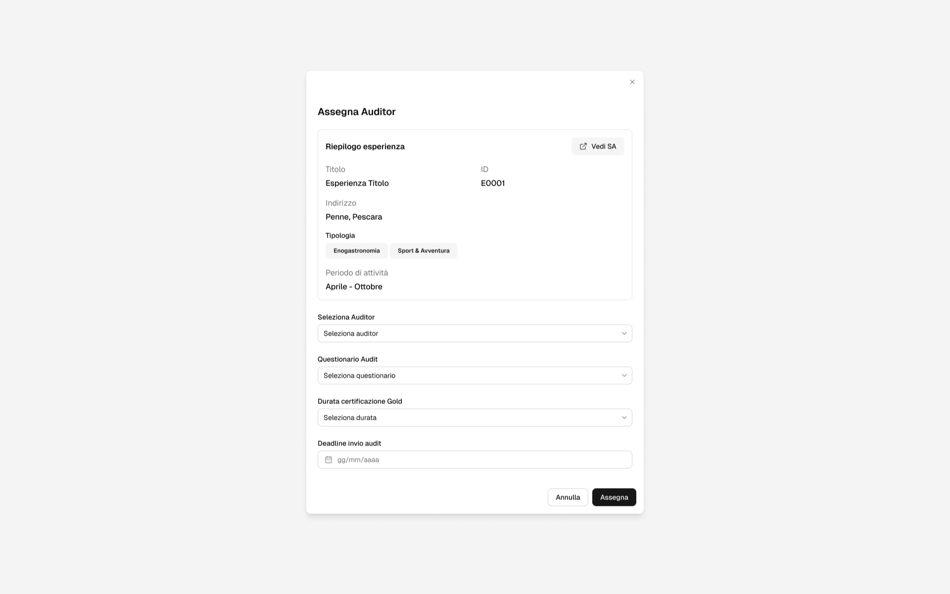
The Supervisor assigns an audit from a single dialog. It shows a summary of the experience, with location, categories, season and a link to its self-assessment, and asks for the auditor, the audit questionnaire, how long the Gold certification will last and the deadline. The auditor gets the information needed to book the experience like any other customer, accepts the audit, visits the experience and then fills in the checklist, adding photos and documents. The checklist can be saved and completed later.

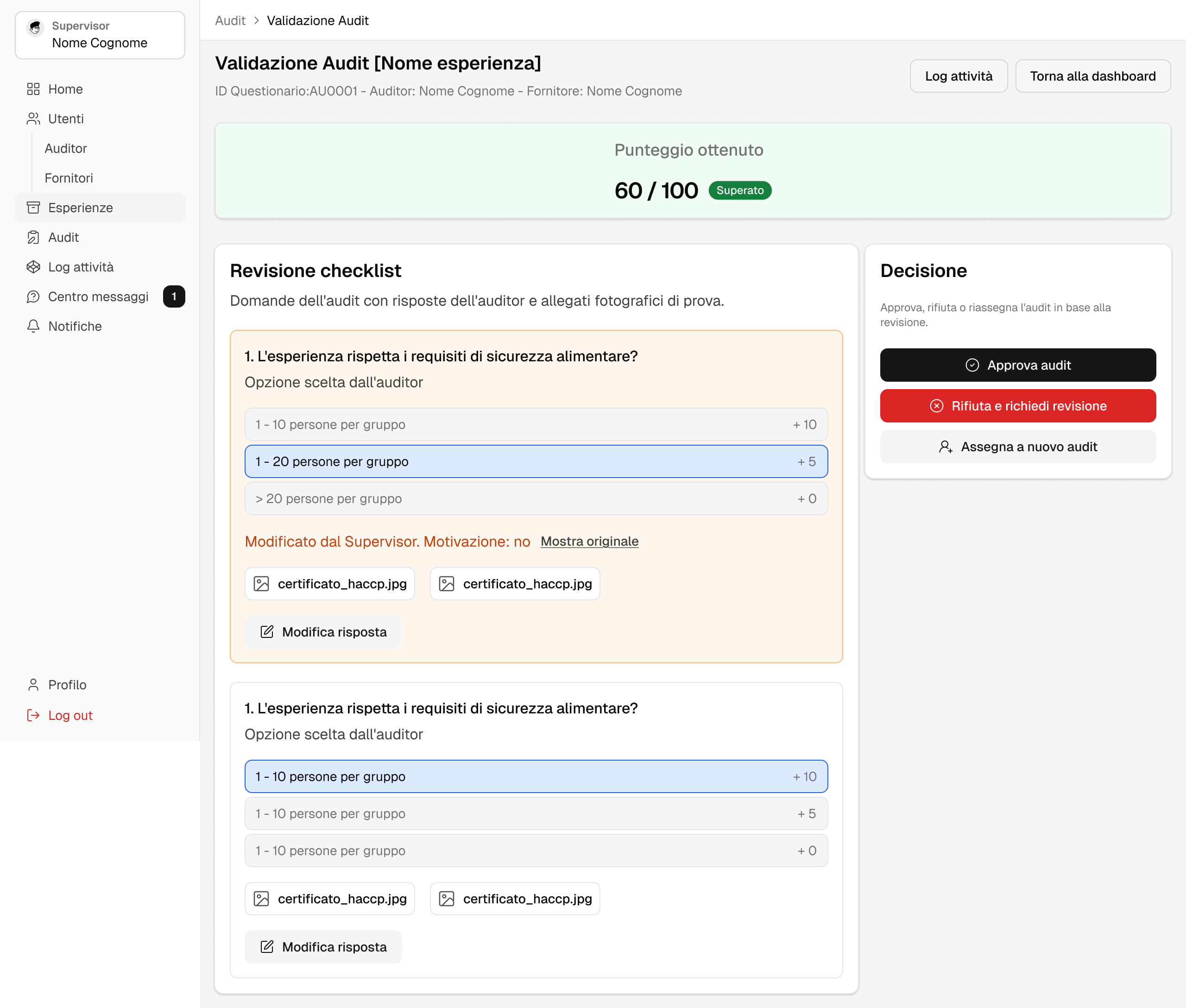
On the validation page the score comes first. Below it there is every question with the answer chosen by the auditor, the points for each option and the photos. The Supervisor can change an answer, but has to write a reason: the change is marked on the question, the original answer can still be viewed and the score is updated. The final decision is in a side panel with three buttons: approve, reject and ask for a revision, or assign a new audit. This way it is always clear who decided what before a Gold badge is given.

Dialog to assign the auditor, questionnaire, Gold duration and deadline
Audit validation with score, checklist answers and photos, Supervisor edits and decision panel

The public catalog

For the public catalog I worked on the information architecture and the visual identity, then on wireframes and UI. Travellers do not know how the certification works, so every card shows the Silver or Gold badge together with the main information about the experience.

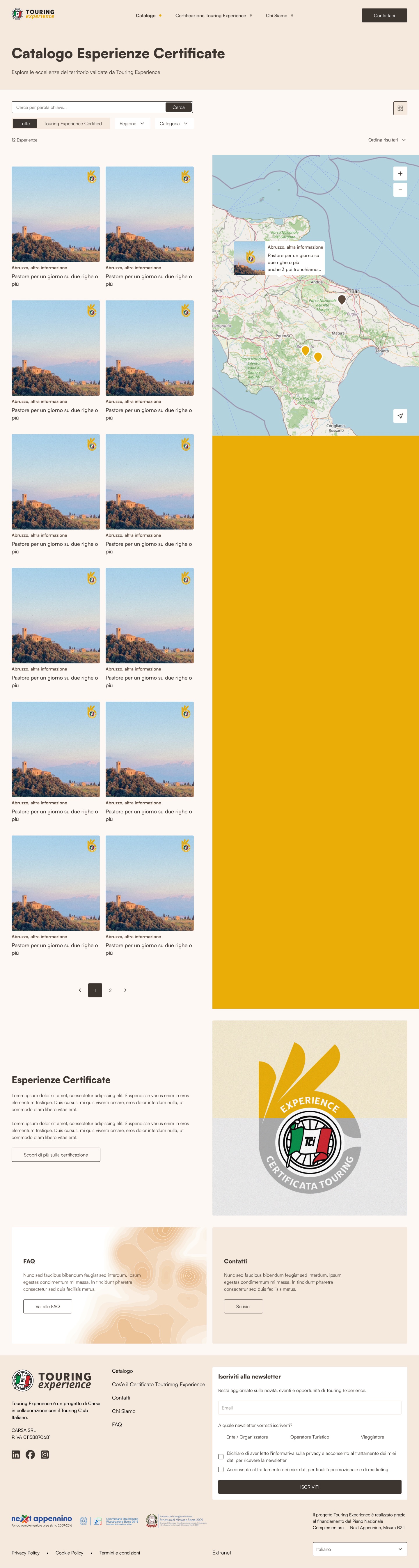
The catalog shows the experiences in a grid next to a map, so people can look for experiences by place or by interest. They can search, filter by region and category or show only certified experiences. Below the results there is a short section that explains what the certification means.

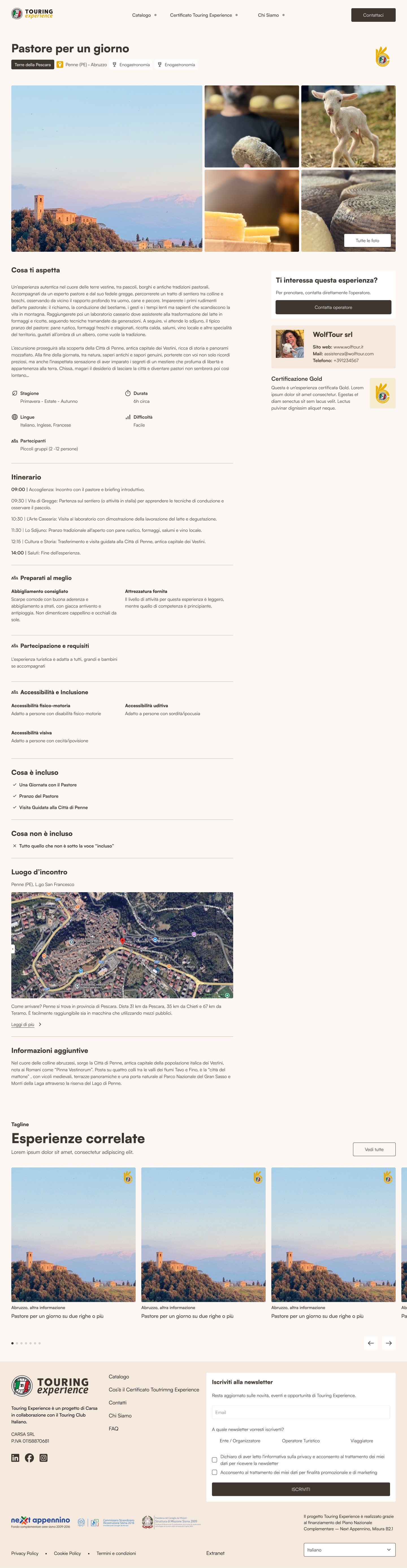
Each experience page starts with a photo gallery and the certification badge. Then it covers what a traveller needs to decide: season, duration, languages, difficulty and group size, the itinerary with times, what to bring, accessibility, what is included and what is not, and the meeting point on a map. A sidebar keeps the operator contacts and the certification level visible while scrolling, and the page ends with related experiences. The catalog is in Italian and English.

Public catalog with experience grid, map and filters Experience page with gallery, certification badge, itinerary and operator contacts

Testing before go-live

Before go-live I tested every flow from start to end several times, using each role. I created experiences, let deadlines expire, failed and passed questionnaires, reassigned auditors and published experiences. After each round I wrote bug reports for the frontend and the backend, until the platform worked as described in the flow.

My Role & Deliverables

  • Workshop with the client's CTO and marketing manager, run together with the PM.
  • Research on possible solutions and choice of shadcn/ui as the component library.
  • Swimlane flow of the whole certification process, with statuses and notifications.
  • Roles, permissions and limits for four user types, including the mandatory onboarding.
  • Status model with role-based labels, and the automatic system for deadlines and renewals.
  • Mapping document with inconsistencies and open questions for the client.
  • Wireframes and UI for the whole management platform.
  • Information architecture, visual identity, wireframes and UI for the public catalog.
  • End-to-end testing and bug reports for frontend and backend.

Where it is now

The platform is going live now, so there is no usage data yet. So far the project has:

  • replaced spreadsheets and emails with one platform that tracks deadlines and renewals automatically;
  • helped the client make the main product decisions before development started;
  • given each role statuses and screens written for them, based on one shared data model;
  • given travellers a catalog where the certification level is visible on every experience.

The marketplace where these experiences are booked is the other half of the project, and I designed that too.

Interactive Mattress Configurator