EM
GEM x Energenius
UX Challenge 2022
01
Project
Overview
Meet Energenius
Energenius is an innovative start-up created through the synergy of energy managers and engineers mastering the field of energy measurement and analysis. Energenius offers automatized solutions for energy management and analysis for industrial clients and big commercial buildings.
Project Objectives
Create a working prototype of a new GUI of GEM, redesigning the whole User Experience and User Interface of the GUI starting from a rigorous analysis of the current interface.
Challenge
Energenius needed to understand the limits and pain points of their current GUI (GEM) both in terms of UX and UI in order to create a new platform that had in mind the final users (energy managers) and their needs. The company asked for a working prototype of the redesigned dashboard, keeping under consideration the limitations imposed by Grafana.
02
Process
The design sprint
The UX Challenge consists in a 5-day design sprint. In the case of my team, we had to follow a reverse design sprint:
Mapping the problem
User testing
Sketching
Prototyping
Tune and deliver
03
The problem
Diving into current issues
Together with Matteo Gerola, Research & Development Manager, we gathered the main pain points of the current GUI, together with the desired improvements and additional functionalities. We analyzed the user flow of the current GUI.
04
User Testing
It's time to interview
We conducted 4 1-hour interviews with energy managers who actively used GEM everyday. The remote interviews required the 4 energy managers to share their screen and guide us through the current GUI while also performing specific tasks we decided were important to understand how to improve the user flow. During the entire length of the interviews, users were asked to think aloud and elaborate on every move they made, explaining their thinking processes behind each decision. Interviews were recorded and the data collected was analyzed and classified in clusters of main pain points.
Pain points
/1.
No navigation bar
/2.
The map in the homepage was ignored
/3.
Too many graphs and often too complicated to understand
/4.
Drop-down menus were not used because hardly understandable
/5.
Timeframe setting was overly complicated
05
Prototyping
Trial and Error
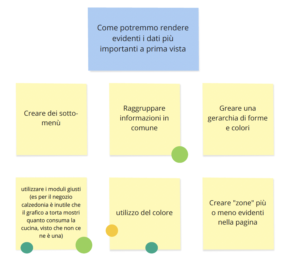
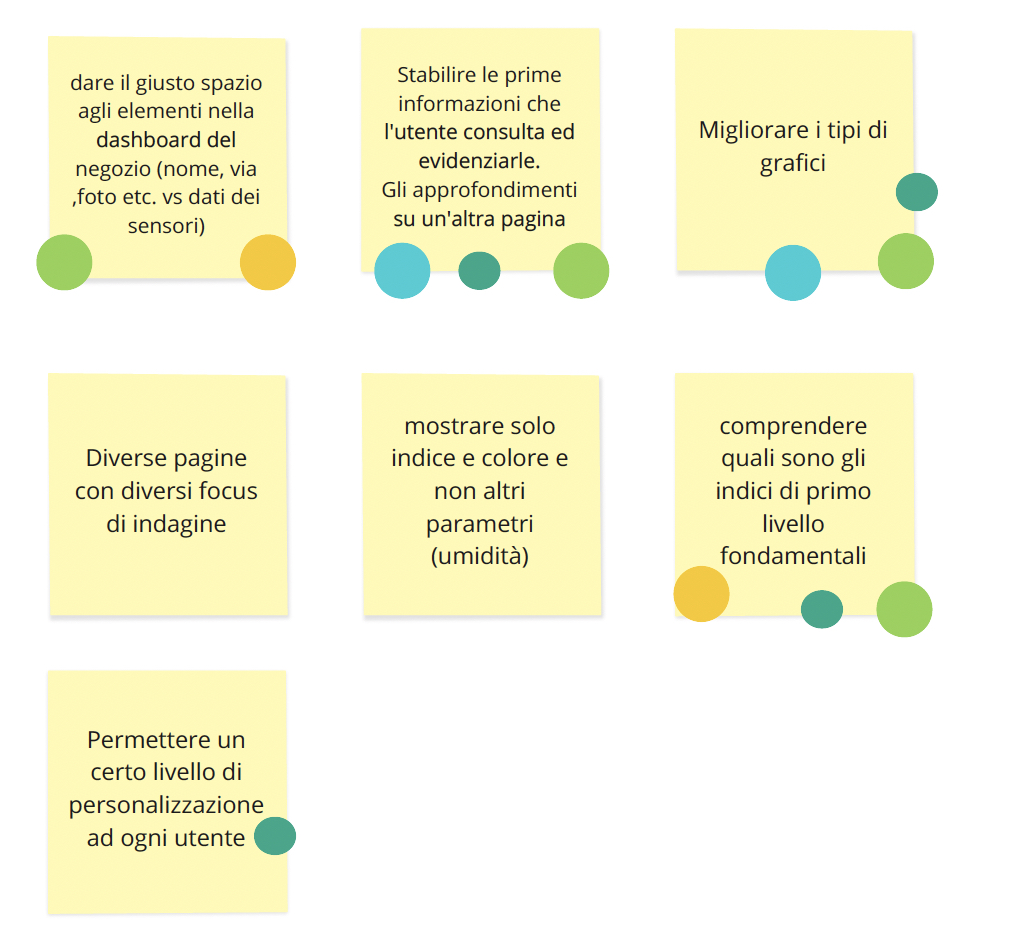
Each member of the team sketched how the new GUI could be, trying to find the most suitable solution for the pain points we found and explaining every design choice. Every solution was rated by the whole team to find a common line of action.
06
The solution
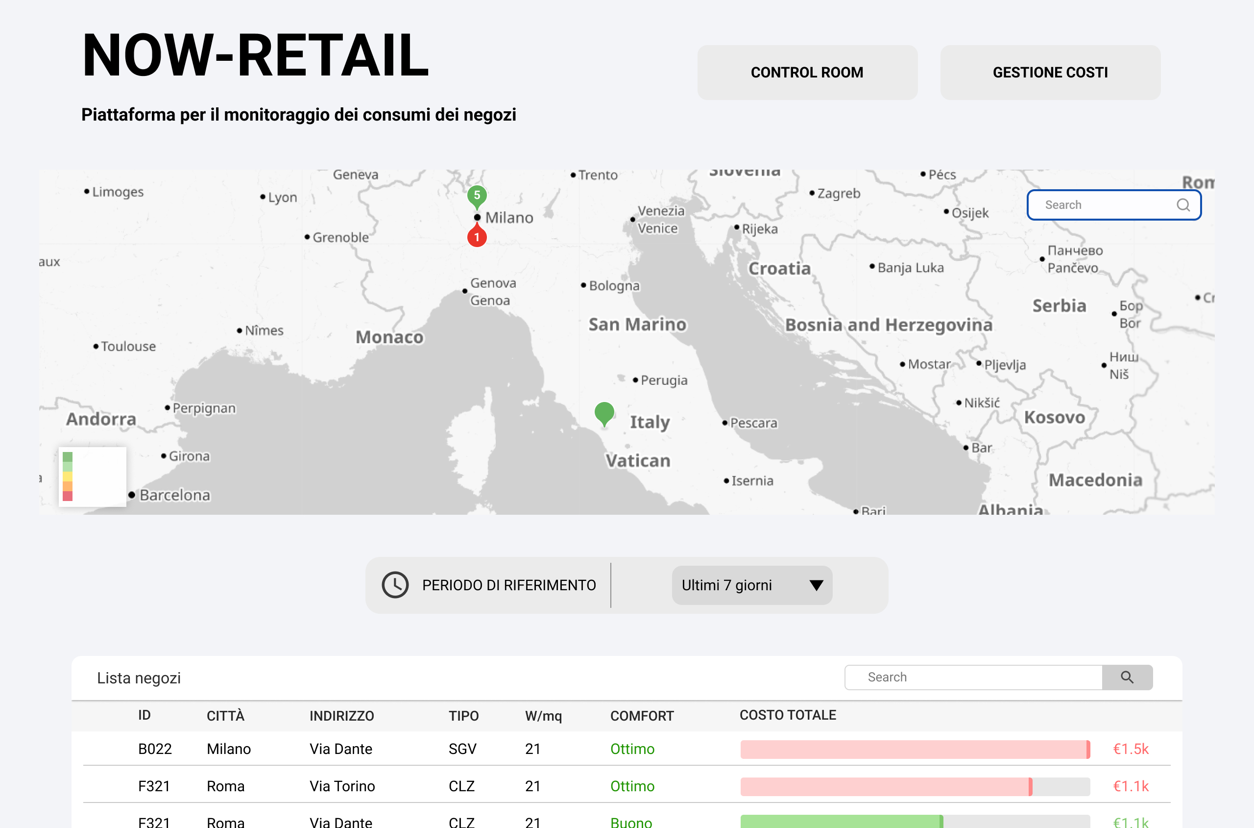
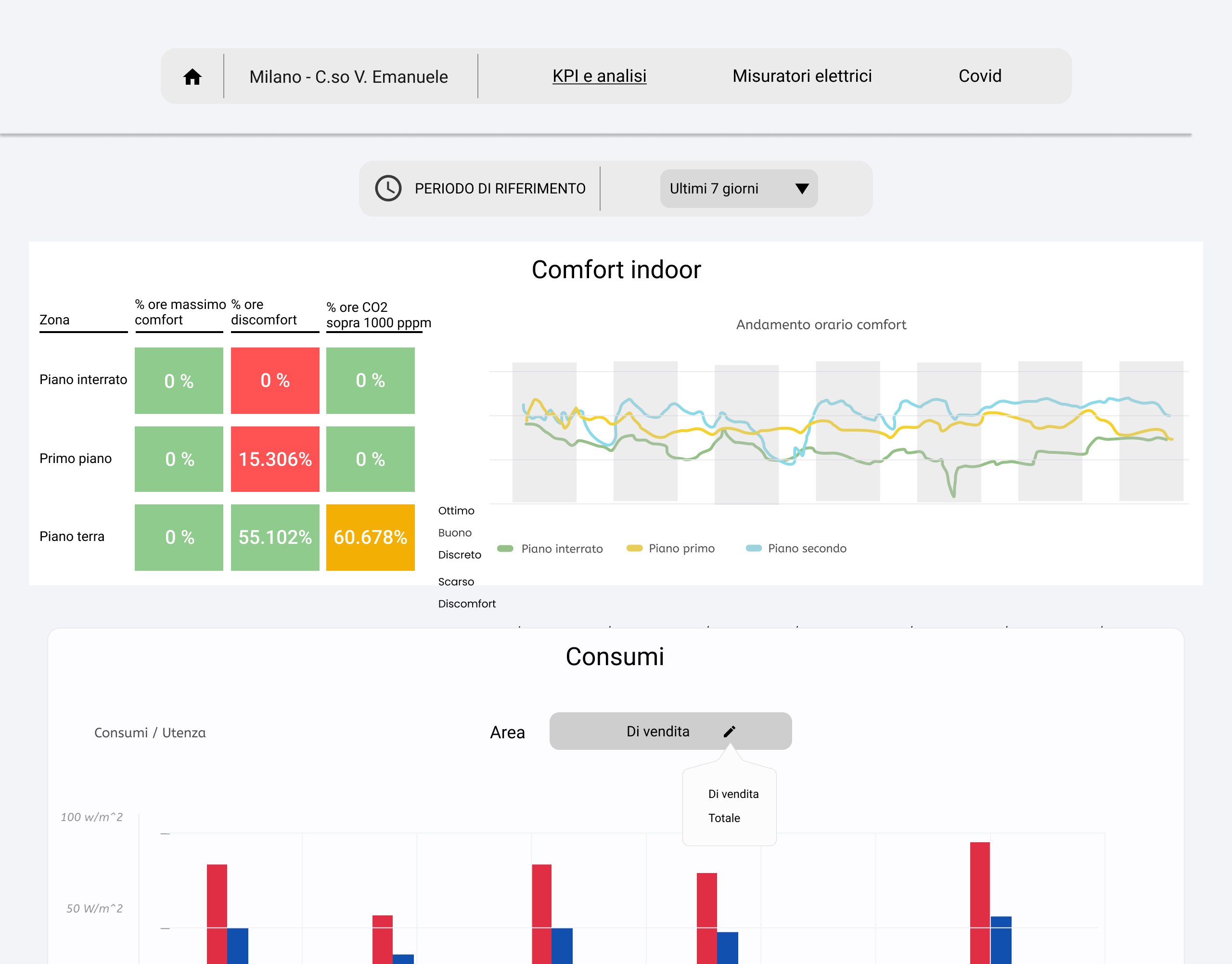
Connecting the dots
In our proposed solution we addressed all the main pain points while also redesigning the interface to give it a more modern look. We added a simple navigation bar with a prominent home page button to allow the user to easily move from one page to the other. The map in the homepage was modified to be bigger and functional:: now the user have an overview of all the stores and their status. All the graphs were either renovated, modified or deleted. All the pie charts were substituted with bar charts which are easier and quicker to read. Color coding was added and used consistently throughout the whole GUI to guarantee easier understandability. Both charts and graphs are now interactive, with the possibility to filter, order and select items. Drop-down menus were substituted with easier-to-use components, the choice reflecting the affordabilty of the action the user could perform. Time frame setting, one of the most important features of the entire GUI, was redesigned and made more prominent and accessible.